css制作超萌吃豆豆加载动画效果
更新时间:2026-04-09 17:43:55作者:zy
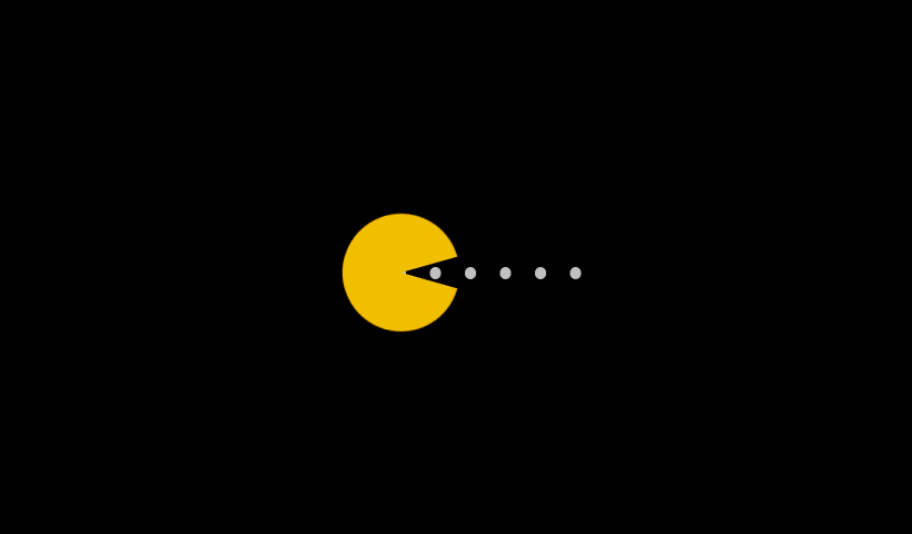
这篇文章主要介绍了css制作超萌吃豆豆加载动画效果,需要的朋友可以参考下
豆豆加载效果
point_down:html代码:
<div class="demo">
<div class="pacman"></div>
<div class="dot"></div>
point_down:css代码:
<style>
@-webkit-keyframes up {
0%, 100% { transform: rotate(0); }
50% { transform: rotate(-30deg); }
}@-moz-keyframes up {
0%, 100% { transform: rotate(0); }
50% { transform: rotate(-30deg); }
}@-o-keyframes up {
0%, 100% { transform: rotate(0); }
50% { transform: rotate(-30deg); }
}@keyframes up {
0%, 100% { transform: rotate(0); }
50% { transform: rotate(-30deg); }
}@-webkit-keyframes down {
0%, 100% { transform: rotate(0); }
50% { transform: rotate(30deg); }
}@-moz-keyframes down {
0%, 100% { transform: rotate(0); }
50% { transform: rotate(30deg); }
} @-o-keyframes down {
0%, 100% { transform: rotate(0); }
50% { transform: rotate(30deg); }
}@keyframes down {
0%, 100% { transform: rotate(0); }
50% { transform: rotate(30deg); }
} @-webkit-keyframes r-to-l {
100% { margin-left: -1px; }
} @-moz-keyframes r-to-l {
100% { margin-left: -1px; }
} @-o-keyframes r-to-l {
100% { margin-left: -1px; }
} @keyframes r-to-l {
100% { margin-left: -1px; }
} body {
background: #000;
overflow: hidden;
margin: 0;
}
body .pacman:before, body .pacman:after {
content: '';
position: absolute;
background: #FFC107;
width: 100px;
height: 50px;
left: 50%;
top: 50%;
margin-left: -50px;
margin-top: -50px;
border-radius: 50px 50px 0 0;
-webkit-animation: up 0.4s infinite;
-moz-animation: up 0.4s infinite;
-o-animation: up 0.4s infinite;
animation: up 0.4s infinite;
} body .pacman:after {
margin-top: -1px;
border-radius: 0 0 50px 50px;
-webkit-animation: down 0.4s infinite;
-moz-animation: down 0.4s infinite;
-o-animation: down 0.4s infinite;
animation: down 0.4s infinite;
} body .dot {
position: absolute;
left: 50%;
top: 50%;
width: 10px;
height: 10px;
margin-top: -5px;
margin-left: 30px;
border-radius: 50%;
background: #ccc; z-index: -1;
box-shadow: 30px 0 0 #ccc, 60px 0 0 #ccc, 90px 0 0 #ccc, 120px 0 0 #ccc, 150px 0 0 #ccc;
-webkit-animation: r-to-l 0.4s infinite;
-moz-animation: r-to-l 0.4s infinite;
-o-animation: r-to-l 0.4s infinite;
animation: r-to-l 0.4s infinite;
}
</style>
总结
以上所述是小编给大家介绍的css制作超萌吃豆豆加载动画效果,希望对大家有所帮助。


