分享一个H5原生form表单的checkbox特效代码
2018-03-13 11:04作者:zy
这篇文章主要介绍了分享一个H5原生form表单的checkbox特效代码的相关资料,小编觉得挺不错的,现在分享给大家,也给大家做个参考。一起跟随小编过来看看吧!
本文介绍了分享一个H5原生form表单的checkbox特效代码,分享给大家,具体如下:
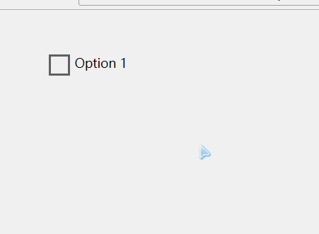
效果如下:
<!DOCTYPE html>
<html>
<head>
<meta charset="UTF-8">
<title></title>
<style>
.md-checkbox {
margin: 50px;
position: relative;
height: auto;
font-size: 14px;
}
.md-checkbox label>span.inc {
-webkit-animation: growCircle 0.2s ease;
-moz-animation: growCircle 0.2s ease;
animation: growCircle 0.2s ease;
} @keyframes growCircle {
0%, 100% {
transform: scale(0);
opacity: 0.8;
}
70% {
background: #eee;
transform: scale(1.25);
} }
.md-checkbox label>span.inc {
background: #fff;
left: -20px;
top: -20px;
height: 60px;
width: 60px;
opacity: 0;
border-radius: 50%
!important; -moz-border-radius: 50%
!important; -webkit-border-radius: 50%
!important;
} .md-checkbox input[type=checkbox] {
visibility: hidden;
position: absolute;
} .md-checkbox label {
cursor: pointer;
padding-left: 30px;
} .md-checkbox label>span {
display: block;
position: absolute;
left: 0;
-webkit-transition-duration: 0.2s;
-moz-transition-duration: 0.2s;
transition-duration: 0.2s;
} .md-checkbox label>.check {
top: -4px;
left: 6px;
width: 10px;
height: 20px;
border: 2px solid #26A69A;
border-top: none;
border-left: none;
opacity: 0;
z-index: 5;
-webkit-transform: rotate(180deg);
-moz-transform: rotate(180deg);
transform: rotate(180deg);
-webkit-transition-delay: 0.2s;
-moz-transition-delay: 0.2s;
transition-delay: 0.2s;
}
.md-checkbox input[type=checkbox]:checked~label>.check {
opacity: 1;
-webkit-transform: scale(1) rotate(45deg);
-moz-transform: scale(1) rotate(45deg);
transform: scale(1) rotate(45deg);
} .md-checkbox input[type=checkbox]:checked~label>.box {
opacity: 0;
-webkit-transform: scale(0) rotate(-180deg);
-moz-transform: scale(0) rotate(-180deg);
transform: scale(0) rotate(-180deg);
} .md-checkbox label>.box {
top: 0px;
border: 2px solid #666;
height: 20px;
width: 20px;
z-index: 5;
-webkit-transition-delay: 0.2s;
-moz-transition-delay: 0.2s;
transition-delay: 0.2s;
}
</style>
</head>
<body>
<div class="md-checkbox">
<input type="checkbox" id="test" class="md-check" />
<label for="test">
<span>
</span>
<span class="check">
</span>
<span class="box"></span>
Option 1 </label>
</div>
<script>
var list = document.getElementsByTagName('input');
for(var i =0;i<list.length;i++){
(function(n){ list[n].addEventListener('click',function(e){
var inc = this.nextElementSibling.firstElementChild;
inc.className = ''; setTimeout(function(){
inc.className = 'inc';
},0);
})
})(i) } </script>
</body>
</html>
以上就是本文的全部内容,希望对大家的学习有所帮助。